The Challenge
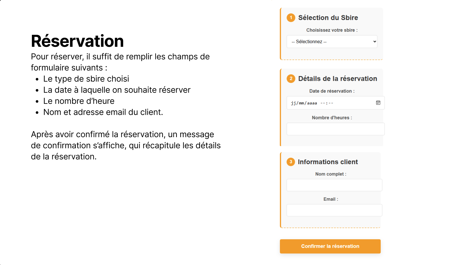
This project was a website we had to make where we can book special services. The initial version had several usability issues and inconsistent styling.
Feedback received:
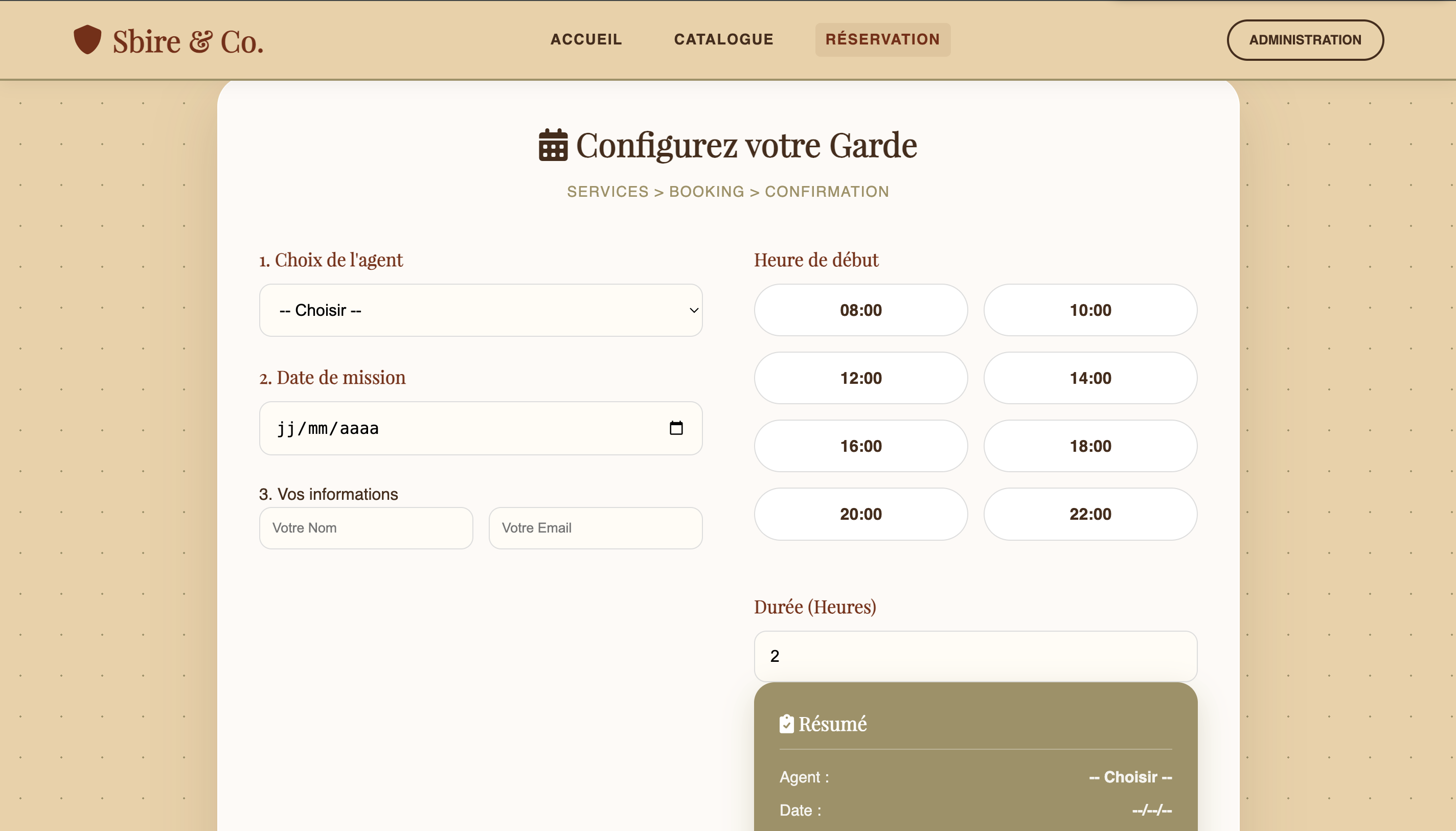
- When selecting an item on the catalog page, it should be selected by default (example: reserve Goomba → click on reserve → Goomba is already selected).
- Text is misaligned on page 1.
- Improve the form to make it more user-friendly / ergonomic.
- Bullet points are not aligned on the receipt.
- Review / adjust the color palette.
- Move the minimum and maximum values higher up in the catalog.
- Highlight the “Super Service” feature more effectively.
- Add / clarify an “Action” column in the reservation table.
Visual Comparison
Before
Basic layout, misalignment issues, generic buttons.
After
Corrected alignment, highlighted features, and improved table structure.
Key Improvements
1. Visual & Layout Fixes
- Alignment: Fixed text alignment on Page 1 and corrected bullet point positioning on the receipt.
- Color Palette: Adjusted the palette (Red Velvet theme) for better consistency and readability.
- Hierarchy: Moved min/max values higher in the catalog and highlighted the “Super Service” feature.
2. UX & Functionality
- Pre-selection: Items clicked in the catalog (e.g., Goomba) are now selected by default on the reservation page.
- Table Clarity: Added a clear “Action” column in the reservation table to guide the user.
- Form Ergonomics: Improved the reservation form layout to make it more user-friendly.