The Challenge
The assignment was to create a comprehensive graphic charter (brand guidelines) for a fictional company. I invented TigerKids, a playful and dynamic brand designed for children's educational toys.
- The initial presentation feels too "flat" and theoretical; it looks like a series of disconnected slides.
- It's hard to visualize how the brand lives in the real world on actual products.
- The layout of the guidelines is too basic and lacks professional polish.
Visual Comparison
Before
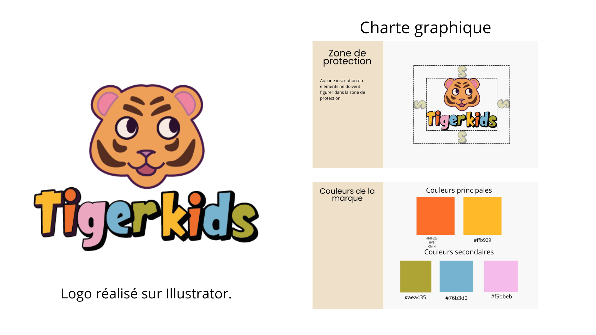
Theoretical layout. Elements (logo, colors, safety zones) are floating on a white background without context.
After
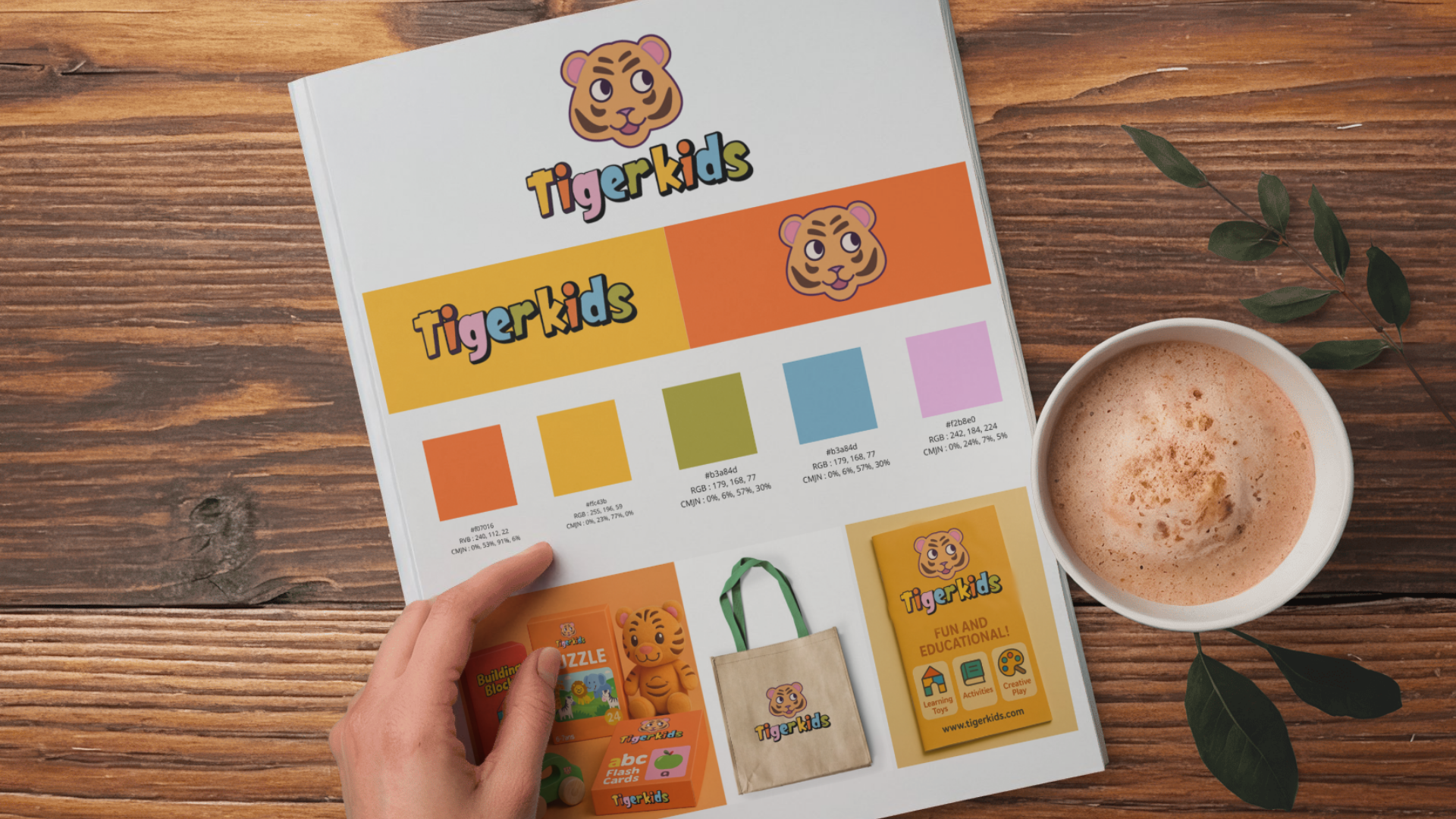
Professional mockup. The brand is applied to products (tote bag, puzzle, cards) in a realistic scene.
Key Improvements
1. Professional Mockup
To address the "flat" look, I moved away from simple 2D slides. I integrated the designs into a photorealistic mockup (magazine style on a wooden table). This instantly adds depth and makes the project look like a finished commercial portfolio.
2. Brand Application (Merch)
Instead of just showing the logo in a "Safety Zone" box, I applied it to concrete items relevant to the target audience:
- Merchandise: Designed a tote bag and puzzle packaging to show how the logo works on different materials.
- Stationery: Created flashcards and a booklet to demonstrate the color palette in use.
- Context: This proves the brand identity is versatile and works for both print and packaging.